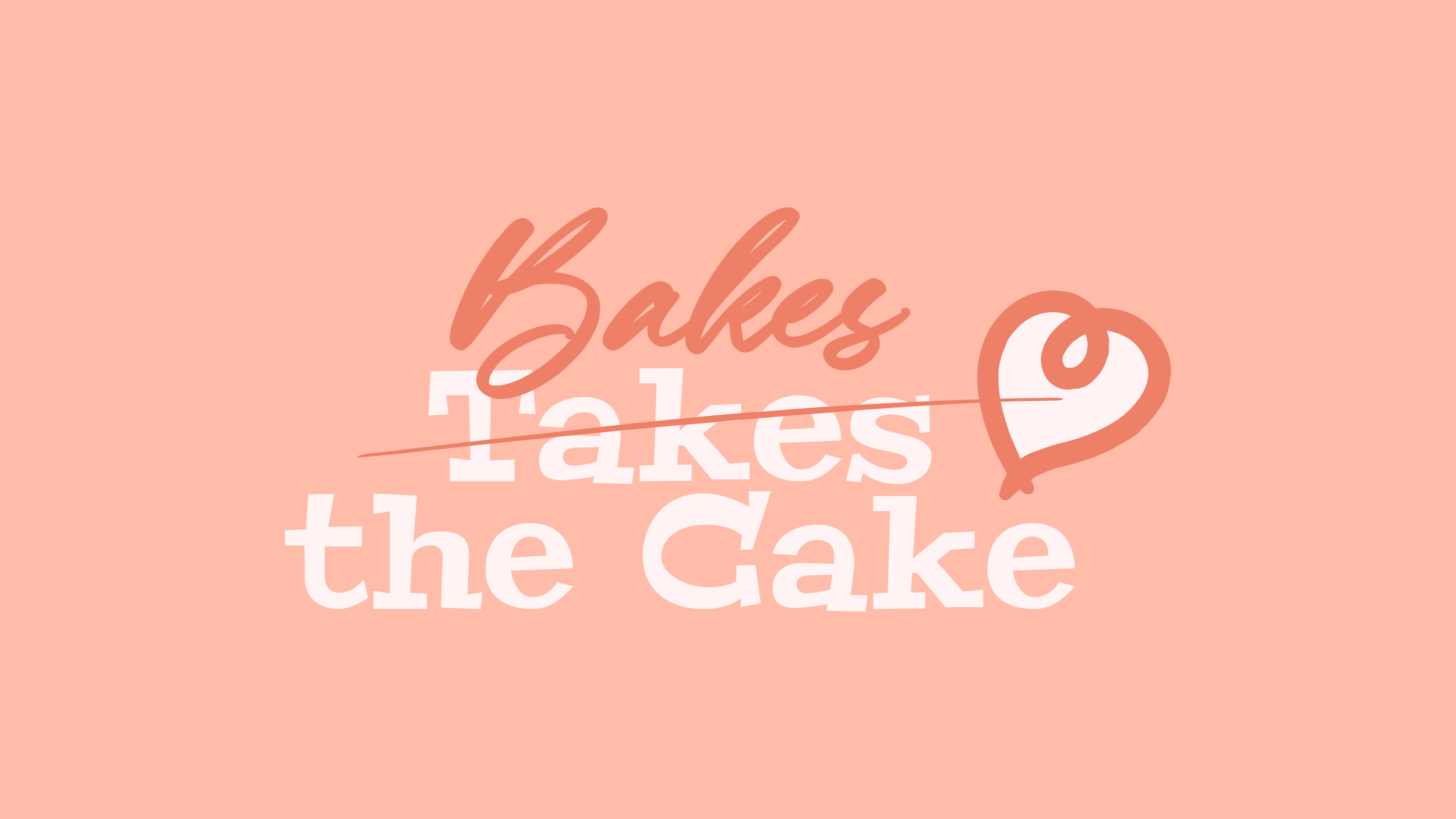
Kacie Steward has been a long time friend and has supplied our family with many delicious treats over the years. In late 2023 she reached out for a visual identity system. I immediately got pencil to paper and started working on this project. After countless sketches it hit me, Kacie IS the brand and Kacie should be the mascot!
We decided on nodding at a mid-century modern style that ever-so-slightly resembled a brand you might see in the game Fallout.
Once the mascot/caricature was created, and the typography was finalized, we worked on a color palette. We aimed for slightly “Gen-Z” colors that felt both
contemporary and retro + warm & inviting.
Then we moved to Logomarks & icons!
We pulled the K, oval shape, and the heart from the main logo for the logomark to be used for Kacie Bakes’ social media profile image.
Finally, we whipped up a great tagline, and voila! Kacie was ready to present her new visual identity system.


